A robust messenger for a powerful all-in-one SaaS suite
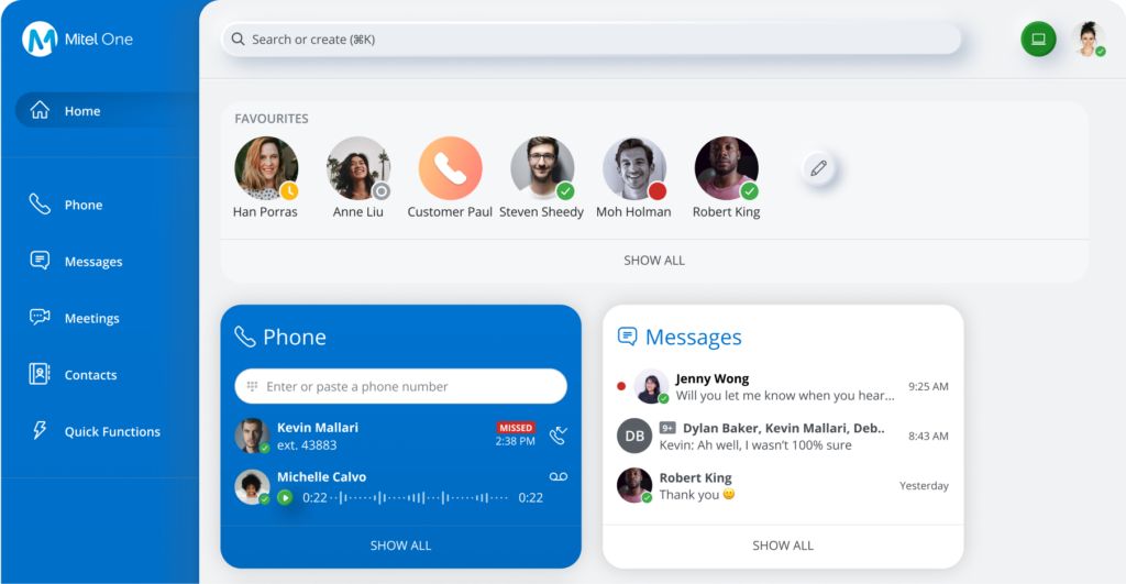
Mitel One would have 5 main features/sections: Phone, Meetings (videoconferencing), Messaging, Global Search, and Quick Functions. Of these, I was responsible for Quick Functions (read about that here) and Messages.
Building the requirements
As UX and product were building requirements for the messages, the consensus was to take features from Mitel’s existing stand-alone apps, and patterns from the familiar app Slack. These requirements were largely based off of the current user base, which we were able to get an abundance of user feedback for what companies and their employees really needed. However, we did more than pattern after other applications, we made it better. Think of Slack on steroids. Mitel One messaging would need:
01
Collaboration spaces (Called Streams in Mitel One)
The app would need “spaces” designed to enable collaboration between teams, projects, and topics.
02
Individual and Group Messages with SMS capability
Enable users to start and respond to individual and group conversations to communicate with others.
03
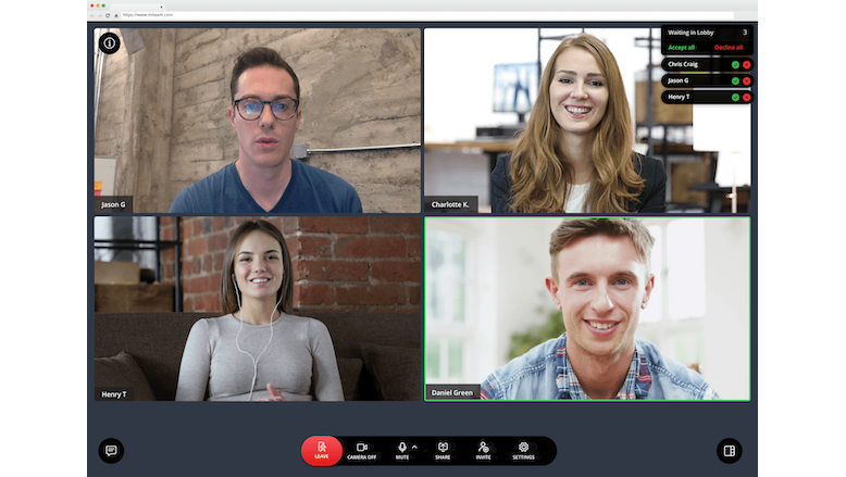
Start videoconference and voice calls from messaging
In just a few clicks we wanted users to start a meeting with a contact or a group during a message conversation.
04
Mute Direct, Group messages and Streams
Since Mitel One markets toward enterprise and is not a Direct-to-consumer product, our users needed more robust notification settings
The approach to product
Once the whole team understood the major requirements and specific user needs, we could approach our individual sections keeping in mind that my work for Messages would impact the rest of the Mitel One sections.
Streams (Collaboration Spaces)
I designed an easy-to-use group collaboration space that was familiar to users coming from Slack, and intuitive to new users that had never used apps like Slack or Microsoft Teams.
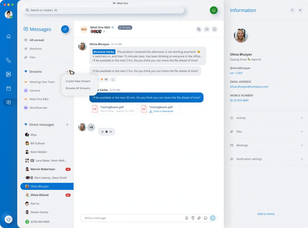
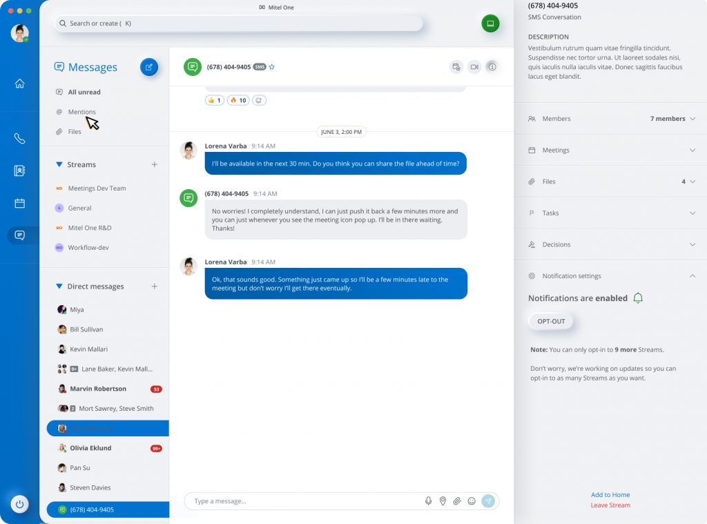
Individual and Direct Messaging+ SMS capability
SMS capability is definitely one of Mitel’s standout points in comparison with other messengers. One of the things to ensure was that there was a seamless transition between messaging someone also using Mitel One, vs someone messaging via their mobile device. I made sure to make it clearly evident what type of user they’re communicating with, while still making the messaging experience consistent.
Start videoconference and voice calls from messaging
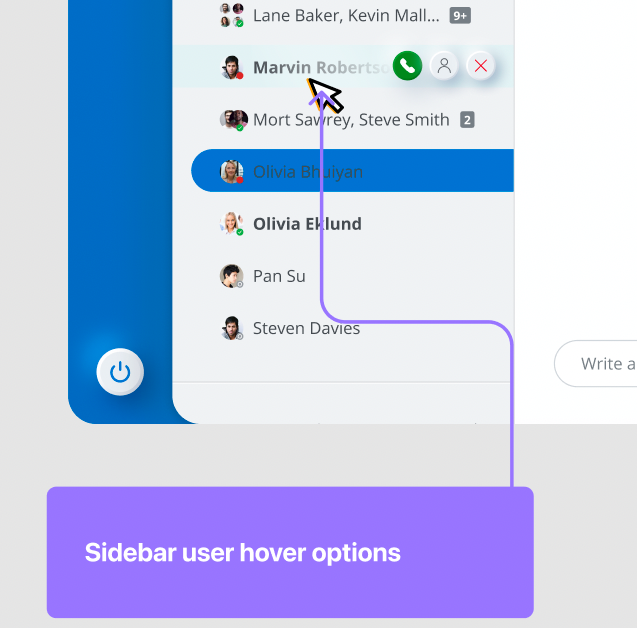
Another standout point was our intuitive hover states for the left sidebar. We allowed users to start voice, video or close the conversation in one click.
Mute direct, group messages and Streams
Our users previously had limited notification options, and these settings would affect the entire application. Our users needed more control at the individual conversation/stream level.
Solving platform/development limitations
While in process of finishing designs for notification options, I was informed by engineering that there would be a platform limitation, which would only allow users to mute up to 10 direct/group messages and “opt-in” to 10 Streams. With this limitation, my intended design would not work until a future version. This led me back to the drawing board to create a simple design solution that could get shipped quickly to handle the temporary limitation.
Postponed notifications design
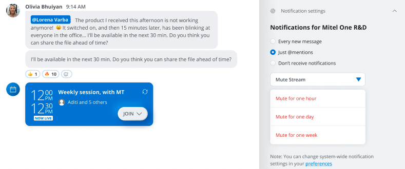
The original design allowed for custom notification settings, including the ability to mute Streams for specified time periods
Impact: This design was put on hold until a version 2 release of Mitel One.
Updated v1 notifications design
The temporary update was a simple button design to either mute or unmute. The design included copy to manage customer expectations when facing the platform limitation.
Impact: This design shipped and because of the newness of Mitel One, the 10 stream max wasn’t too much of an inconvenience, especially since customers new and update was in the works. The v2 original design was shipped a few months later ahead of schedule.
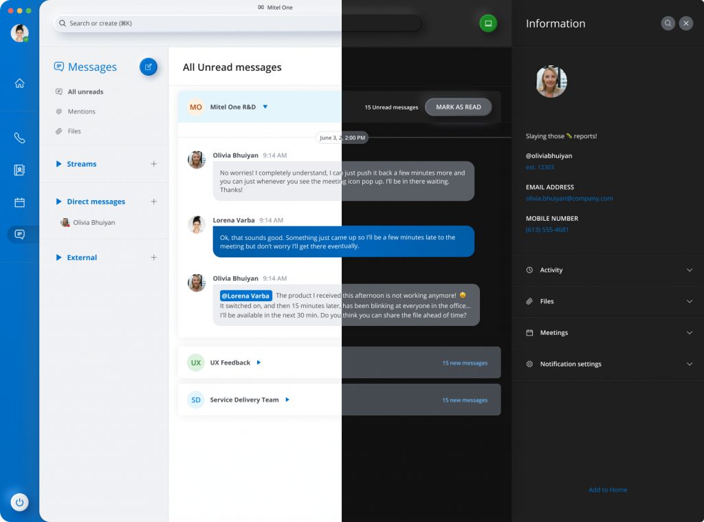
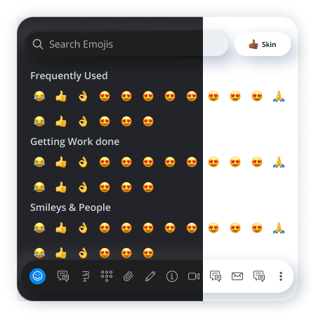
Dark Mode
As we approached the final sprints of designing Mitel One, the product team informed us that Mitel One would in fact ship with Dark Mode capability. While some of our design system components were dark mode enabled, there was still an extensive amount of work that needed to be done for all of Mitel One. I tackled Dark Mode for messages, which ended up including design components for the other sections of the app (Phone, meetings, Global search).
Impact
With the help of a wonderful UX team I was able to complete:
- Design system enhancements, component updates for Messages
- Messages section of Mitel One, and chat components for global Mitel One
- Dark Mode for Messages and for rest of the entire app
Key learnings
- I really appreciated having the transparent communication and overall process, having PMs, Engineering and the UX team on the same page as far as requirements, deadlines and technical limitations, it helped me to property drive the sections of the project that I owned.
- It also helped me to see the importance of organization and having a birds eye-view of what all “crosses together”. So while fortunately there weren’t any working in “silo” situations, we could have done better about integrating various tools for tracking (i.e Jira tickets, vs Miro, etc